Since the early days of the COVID-19 crisis (the past few months!), the spatial and temporal enormity of the situation has been tellingly conveyed in mapped data visualizations. The most compelling maps, in my opinion, have been those created by the New York Times ….

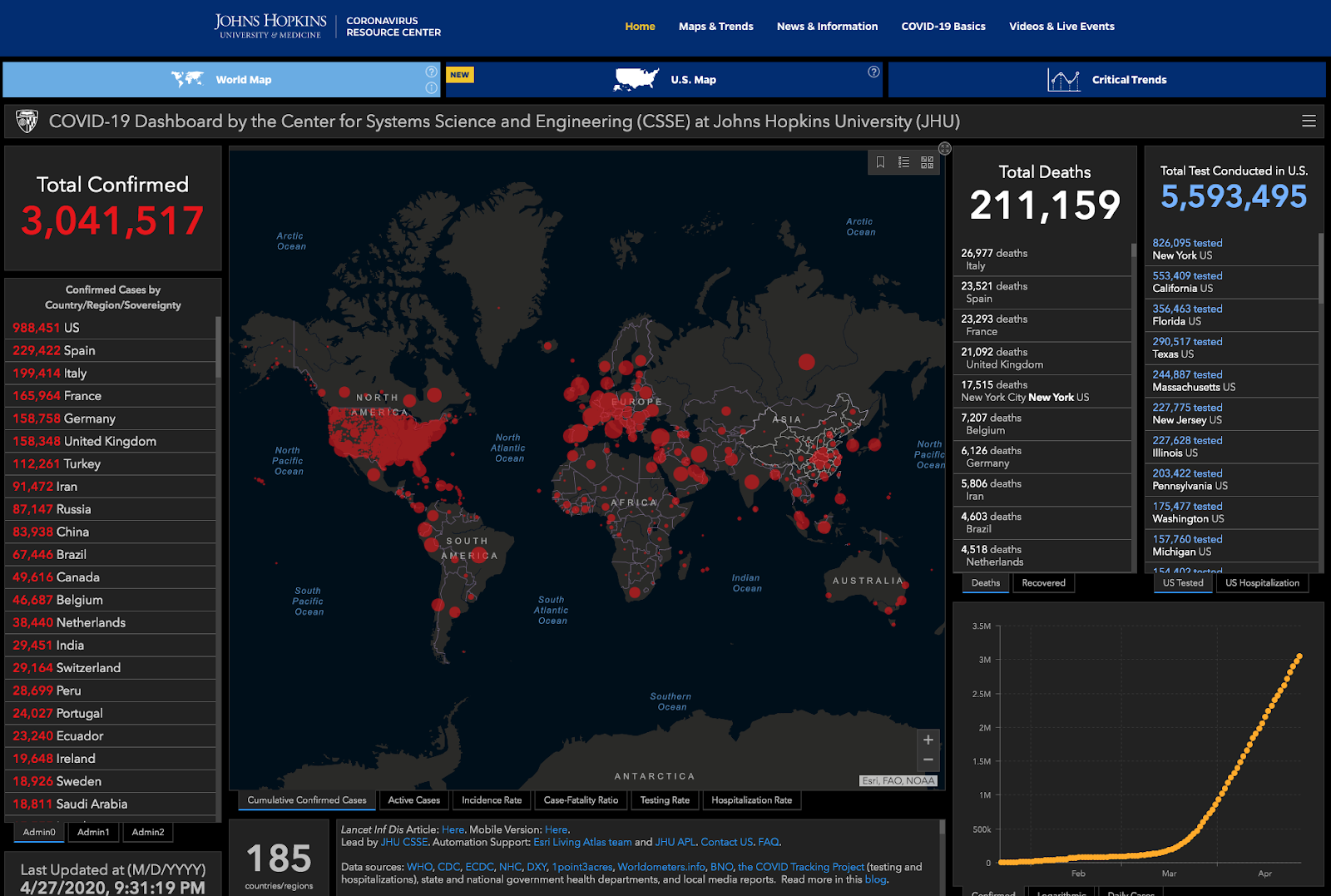
and by the Johns Hopkins University Coronavirus Resource Center
I also want to give a shout out to the maps and visualizations created by the Humanistic GIS Lab at the University of Washington - Seattle
As a person terrified of the destructive power of this virus and its potential impact on my family and loved ones (and of course everyone else) I have spent many hours looking at these data visualizations for signs of a flattening trend in the COVID-19 cases. In doing so, the critic and cartographer in me often makes note of little “improvements” that I would like made to the visualizations, if onlyI had the data, the tools and the time!
Well, enough excuses! The data are available to all, many tools are available to the UC Berkeley community, and some of us (maybe you?) even have the time and the energy to explore these. For this reason, I will point you towards some of the resources you can use if you want to make your own COVID-19 data visualizations, thus adding your unique perspective to the data.
Accessing COVID-19 Data
The best COVID-19 data visualizations are based on the best data - as complete, correct, and current as possible. John Hopkins and the NYT, in particular, have been in the forefront of making daily updates and archival time series versions of COVID-19 data available to the public via github. Check out those links to download the data and become familiar with their various formats and contents.
Visualizing COVID-19 Data
Once you have the data, you can then use your favorite software tool to create visualizations - MS Excel, Jupyter Notebook, RStudio, Tableau, CARTO, ArcGIS, etc. This is a great way to get started by exploring various dimensions of the data and plot types for highlighting these.
However, if you want to make a web based COVID-19 data visualization that folks can access at any time, you need three key things: (1) a way to automatically update the data on a daily basis, (2) a html+javascript file(s) that contains your visualization of these data and (3) a web server to make your file(s) publically available on the web.
There are many tools and technologies for doing any one of these three things but doing all three together is much less straightforward. Therefore, I want to introduce you to a few options that are readily available to UC Berkeley folks. These are based on the John Hopkins University COVID-19 data that is made available, with daily updates, as an ArcGIS Online Feature Layer web service.
Web-based Data Visualizations with ArcGIS Online
The Johns Hopkins University COVID-19 data dashboard, shown above, was created using the ESRI ArcGIS Online Dashboard web app tool. The campus is fortunate to have an ESRI site license that includes ArcGIS Online. You can access this ArcGIS Online server at https://cal.maps.berkeley.edu - log in with Calnet authentication. One of the things you can do on the campus ArcGIS online server is create your own COVID-19 dashboard. Fortunately, ESRI has created a short but detailed COVID-19 Dashboard tutorial on how to do this. Please note however, when this tutorial instructs you to log into ArcGIS.com, you should instead login to cal.maps.arcgis.com!
When you are done with the tutorial, you will have an online COVID-19 dashboard with data that automatically updates daily that you can share with anyone or embed in another website. You can also search ArcGIS Online for other COVID-19 data layers that you could use in your maps and dashboards as there are a number of these with different levels of detail, eg country vs. state vs. county.
If you need more help with ArcGIS Online, check out the tutorials available via the ESRI Lesson Gallery
Working outside the ArcGIS Online Box
ArcGIS Online hosts the Johns Hopkins COVID-19 data and it provides a platform for creating and hosting web maps and data visualization dashboards. However, you can use the hosted data without using the ArcGIS Online platform tools. This means you can get busy making visualizations without doing the heavy lifting of hosting the data yourself.
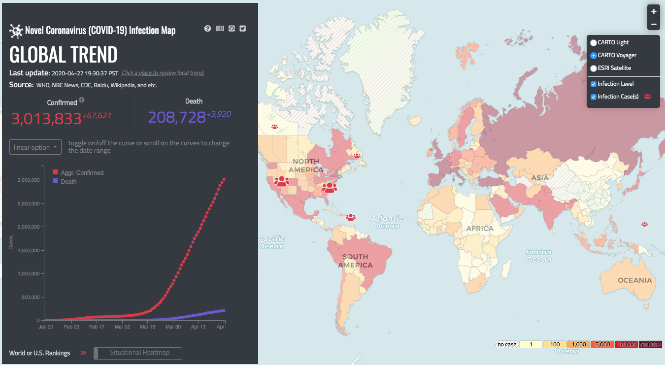
One programming approach is to use the Leaflet Javascript library and the ESRI Leaflet plugin to create a web map that visualizes the ArcGIS Online hosted COVID-19 data. This gives you the freedom to be creative with your visualization and the power to code a lightweight web map that won’t overload your browser as some web maps do. However, you will need to know a bit of Javascript and HTML in order to customize a few lines of code and troubleshoot errors that inevitably come along. You also need a web server to host the map file. Fortunately, github and gitub.io pages can provide this for you for free, again with the proviso that you know how to use them. If you want to check out this approach, see the source file for the COVID-19 map shown below and visible here

If this approach works for you, try editing the html file so you can map a different variable in the COVID-19 data. For example, as shown in the John Hopkins COVID-19 US Dashboard, mapping COVID-19 cases per 100,000 persons may make a better map than a map of the count of confirmed cases since it normalizes the data and makes it comparable across counties with vastly different populations. Do do this, update all references in the file to the data variable Confirmed with that of Confirmeddb (you can find the full list of available variables on ArcGIS Online.) You will need to update the select list and the color breaks used by the map and legend as well.
You can code a similar map in R using the R leaflet and R leaflet.esri pages. The implementation shown below wraps the leaflet maps in an R Flexdashboard in order to add some text and allow for multiple maps from within R Markdown. You can view the source file for that map or visualize it here. Note, the R leaflet code is less easy to customize but it provides a great starting point for folks already familiar with R leaflet.

Data Visualization beyond COVID-19
The tools and techniques described above are presented as starting points. There are many other options as well. What's important to note is that these approaches also work with non-COVID-19 data. Let’s hope we soon get to a time when those maps and data visualizations become less commonplace and no longer require daily data updates. Until then, stay safe!